Maxx
- 0 Posts
- 8 Comments

 15·4 months ago
I thought it was funny

 134·5 months ago
any better source than a random discord screenshot?
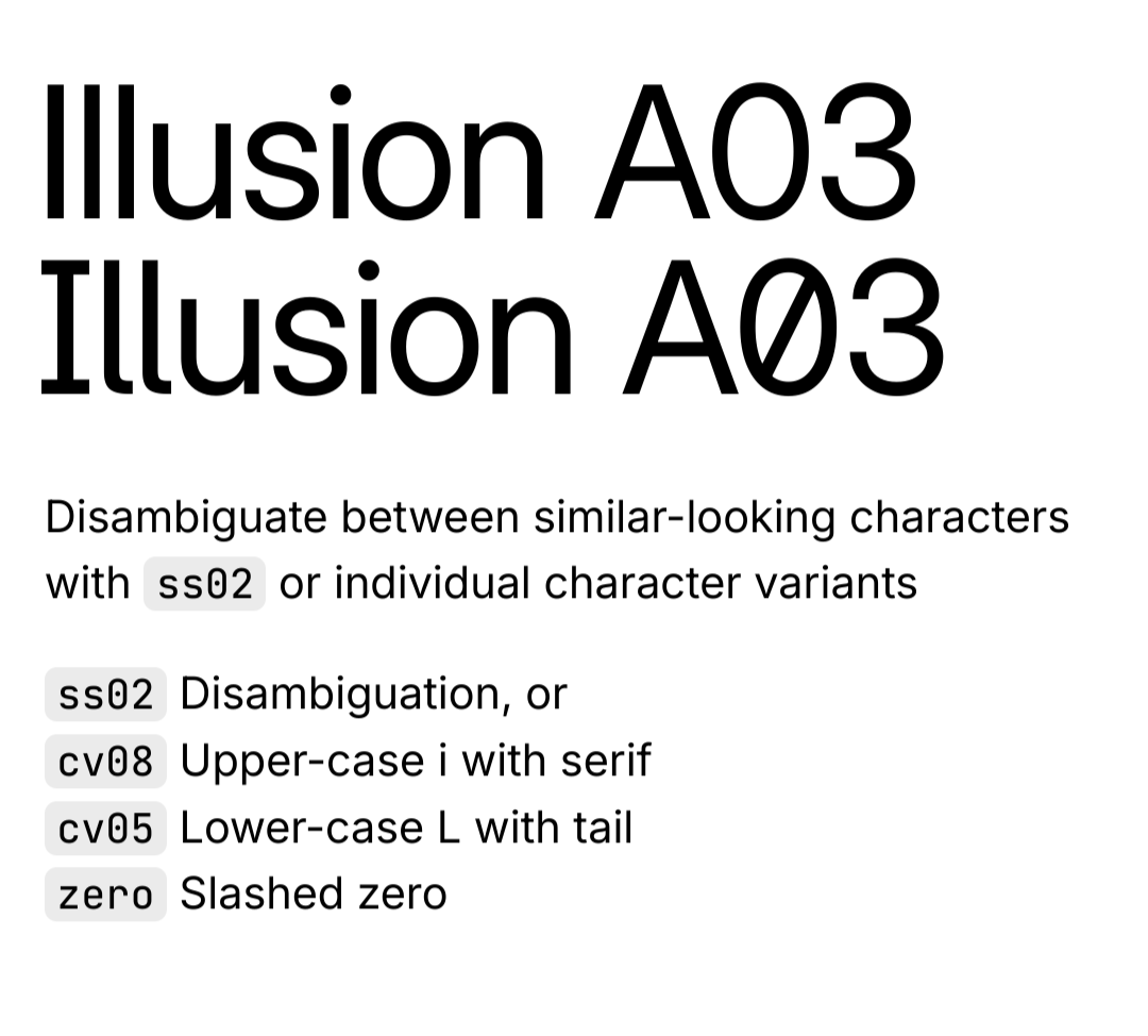
The Inter typeface is very versatile and has many different options and variants, including more distinguishable uppercase i and lowercase L. The article just installed the base version as an example. https://rsms.me/inter/


 15·8 months ago
You can absolutely blame a country for doing that actually. What kind of argument is that? People shouldn’t be upset when their government does something unethical as long as it’s “protecting its interests”?
The geometry and perspective don’t make any sense either.
GNOME. A lot of people customize it to look and behave more like Windows or Macos, and I used to as well, but after giving the default configuration a chance and getting used to it, I prefer it over everything else. It’s way more focused and organized, and I can navigate through my open windows quicker and easier. It’s just a different workflow you need to adjust your brain to.

I also really like the Sonic Youth cover